- Client
- VEPO PREMIUM WATER
- Industry
- BEVERAGE INDUSTRY
- Year
- 2025
We Sell premium water for all
Brand Identity
Vepo isn’t just water it’s a statement. We embody motion, clarity, and modern confidence. Every sip reflects premium quality and a lifestyle that’s bold, clean, and alive with rhythm. From our sleek visuals to our fresh tone, Vepo represents the pulse of the new generation vibrant, unapologetic, and unstoppable.
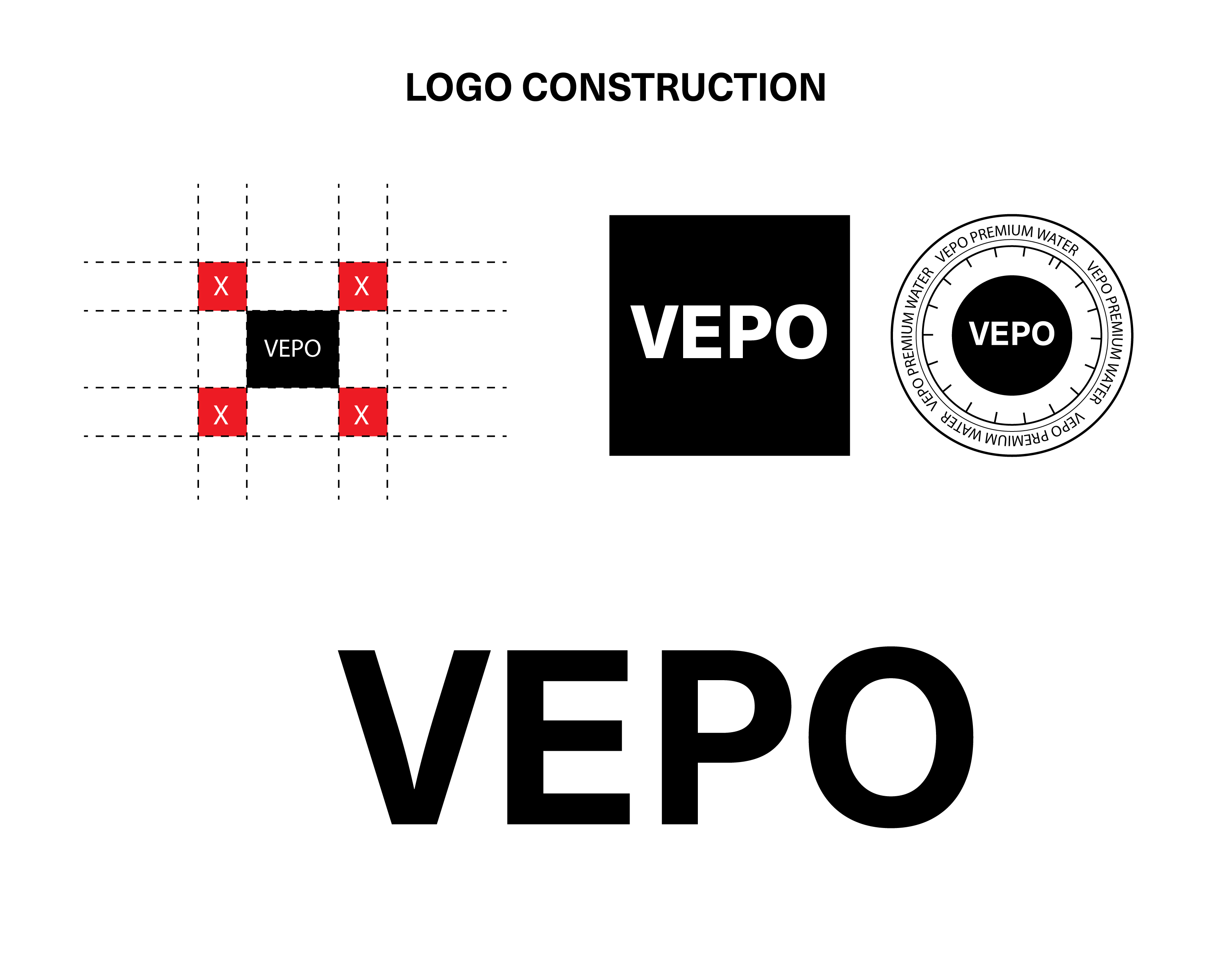
Logo Construction
The **Vepo** wordmark is a reflection of purity in design clean, confident, and fluid. Built on precise geometric balance, the logo embodies the effortless flow of water and the bold simplicity of modern lifestyle brands. Each letter form is intentionally spaced to create a sense of motion and lightness, echoing the clarity and energy that define Vepo. The lowercase presentation conveys approachability and calm confidence, while its smooth edges and minimal structure represent freshness, innovation, and premium quality. The **Vepo** wordmark is more than typography it’s our identity distilled into four letters: bold, fluid, and undeniably modern.
Brand Imagery
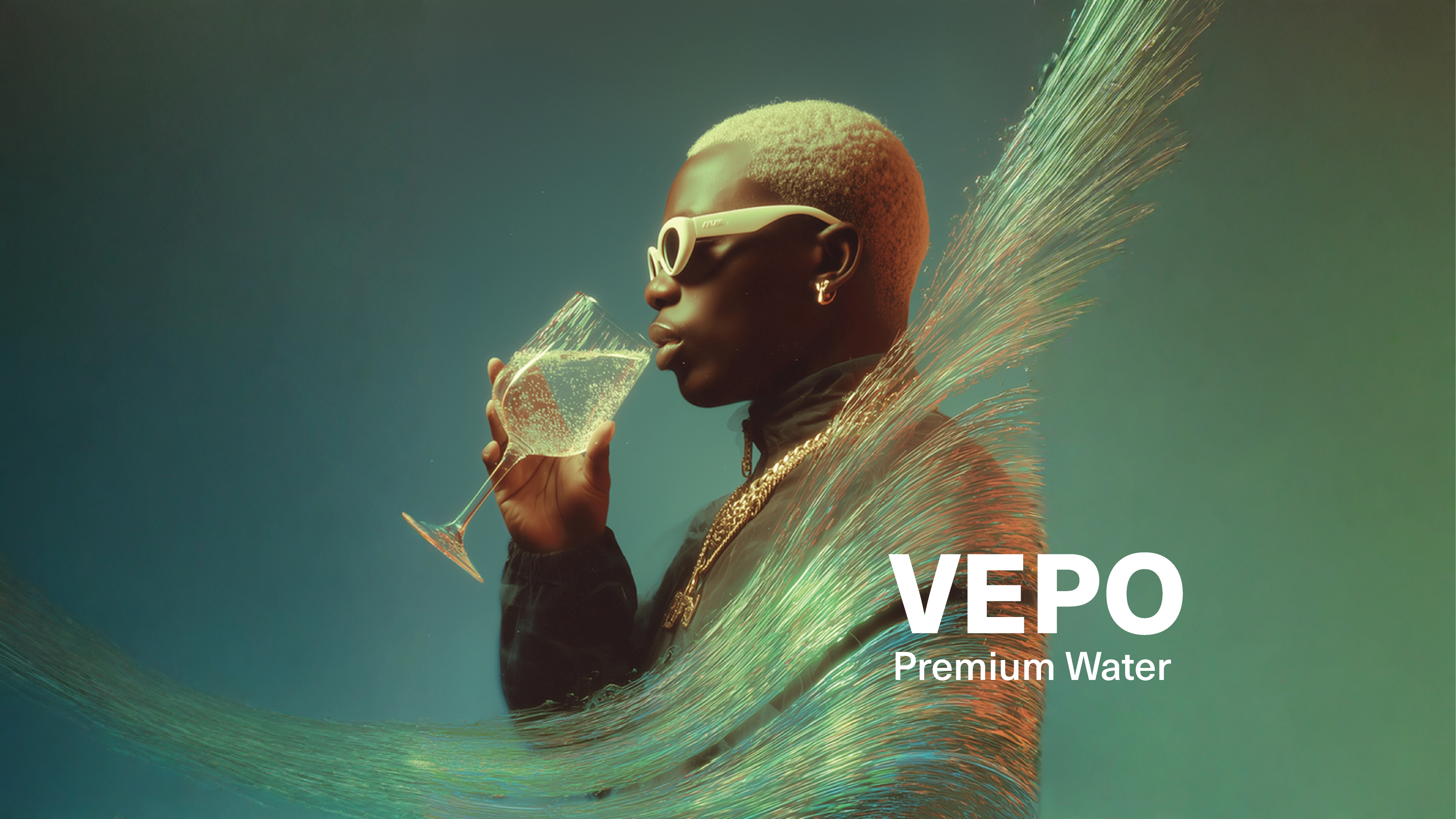
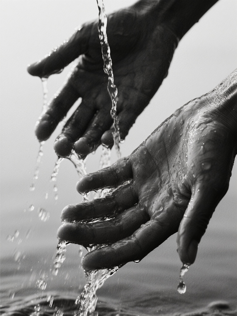
Vepo’s imagery captures the pulse of modern energy bold, fluid, and effortlessly cool. Our visuals blend motion and stillness, expressing the purity of water through vibrant tones, clean light, and dynamic compositions. Each image is designed to feel alive a reflection of clarity, confidence, and premium lifestyle. We use blur, contrast, and glow to convey rhythm and vitality, while our subjects embody freshness and individuality.








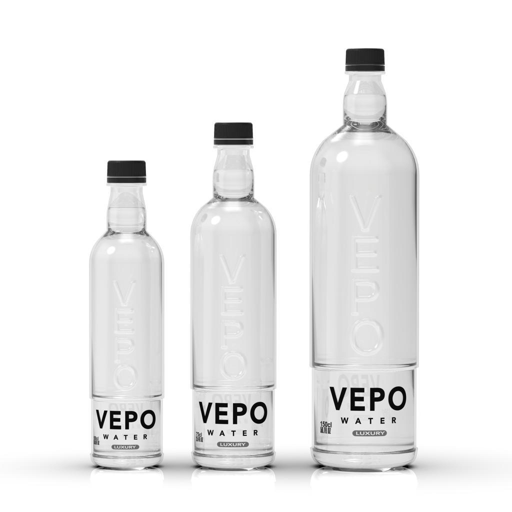
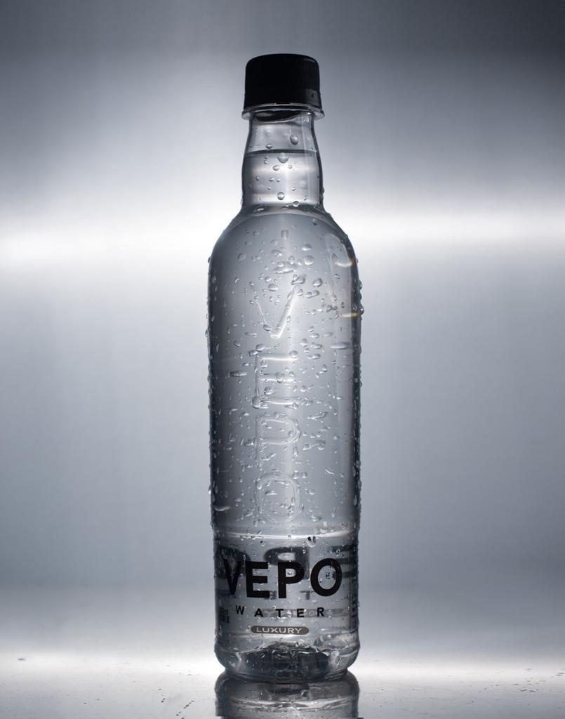
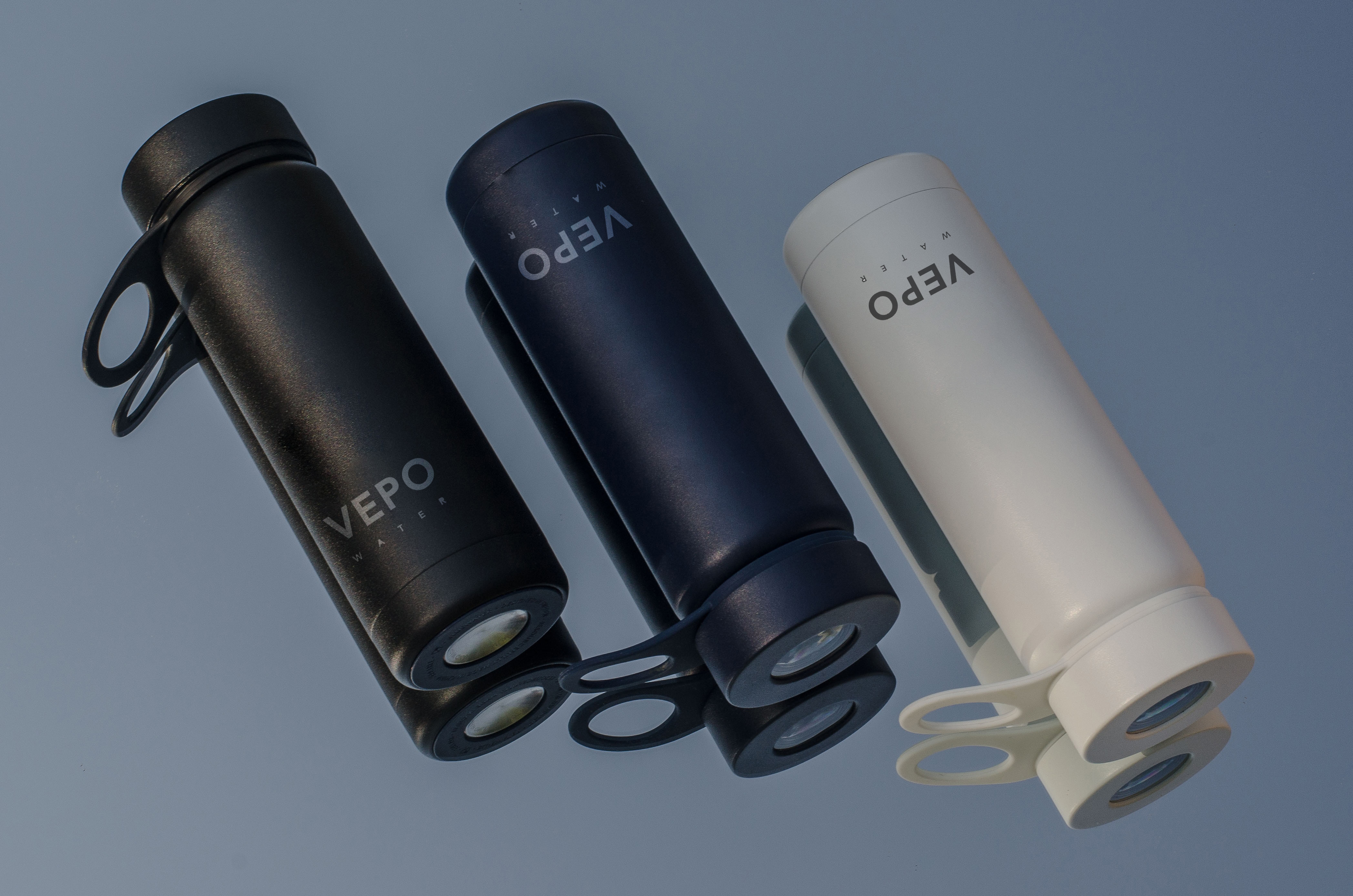
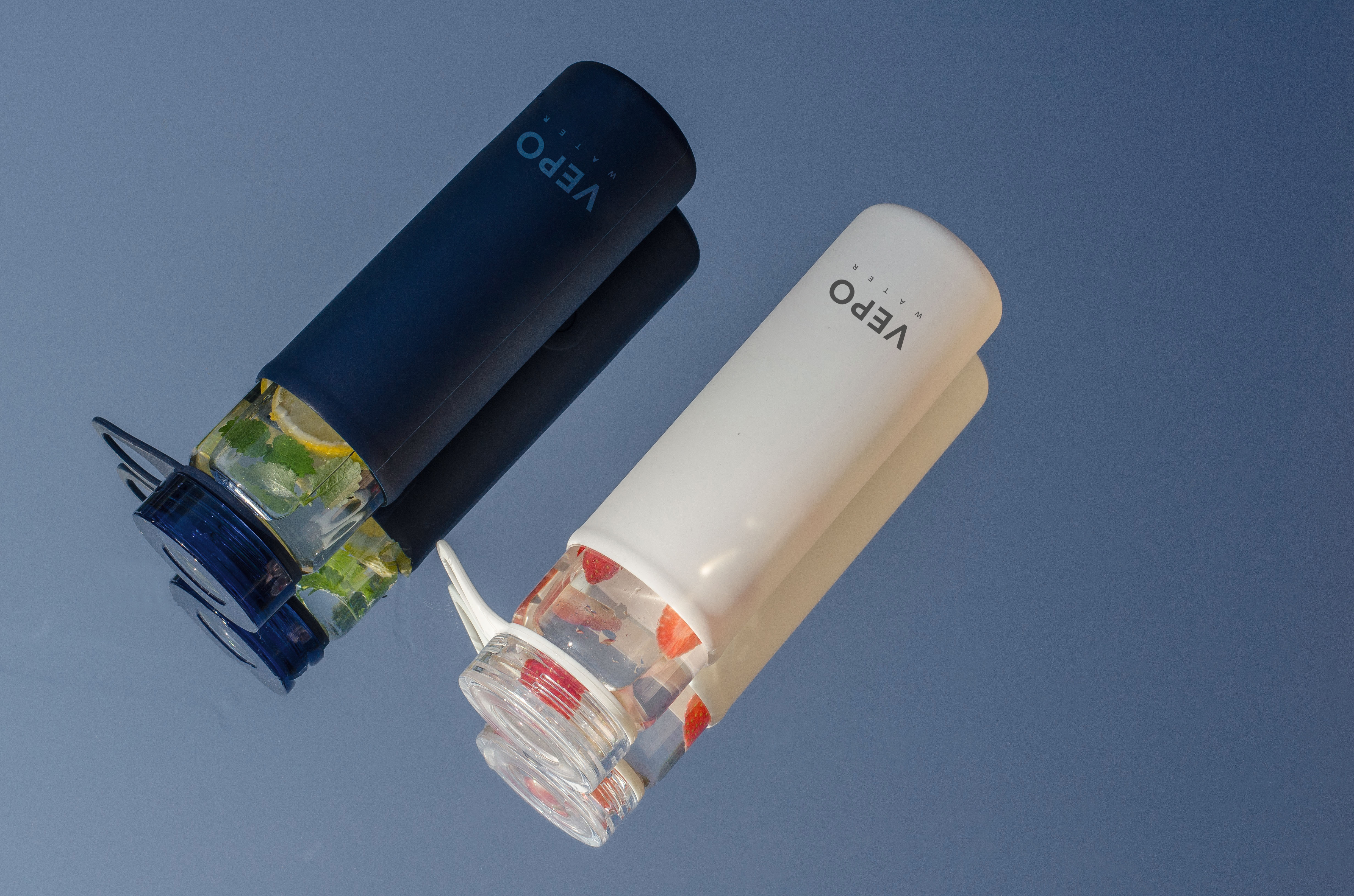
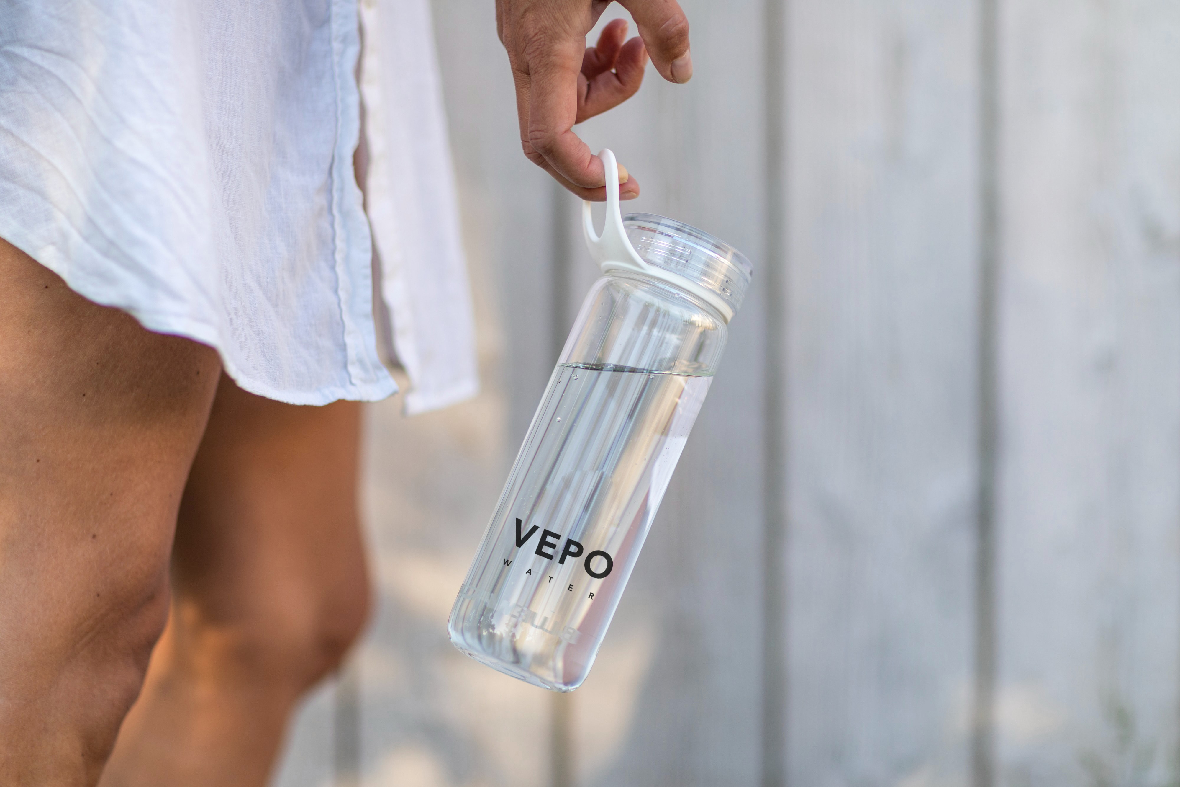
Product Images
Each shot highlights the purity, clarity, and sophistication of our product . Our bottles are presented with a modern edge that evoke freshness and momentum.