- Client
- Yoyo Foods
- Industry
- Food
- Year
- 2025
Yoyo Foods is a brand passionate about delivering mouthwatering meals that bring people together and create moments to cherish. Yooyo Food believes that every bite should be an adventure.
Overview,
Yooyo Foods stands as a vibrant, approachable brand dedicated to promoting freshness, health, and quality in every product. Its visual identity centers around a red apple-inspired logo that symbolizes vitality and well-being, complemented by a splash detail that conveys energy, freshness, and natural goodness.
Logo Ideation
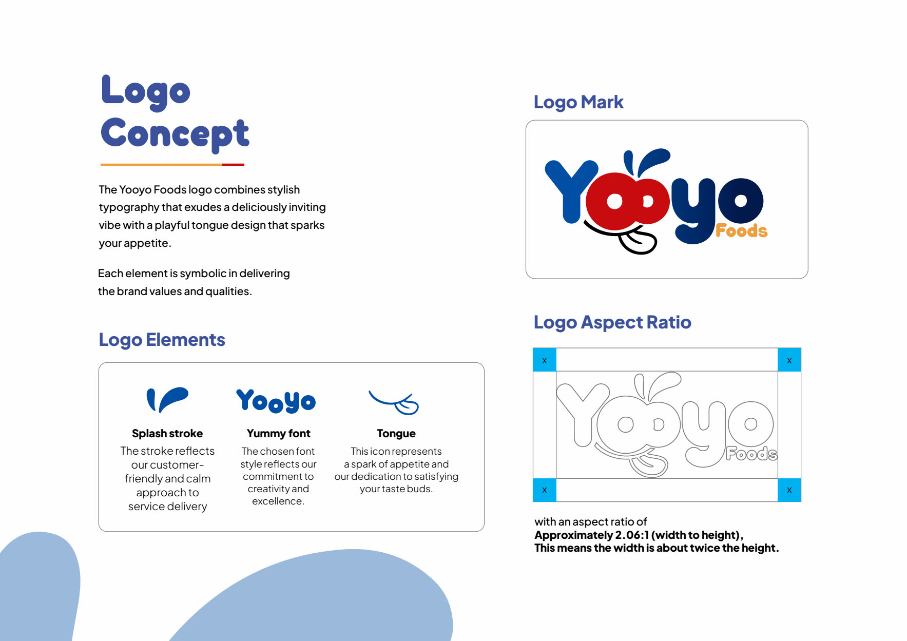
The Yooyo Foods logo combines stylish typography that exudes a deliciously inviting vibe with a playful tongue design that sparks your appetite. Each element is symbolic in delivering the brand values and qualities.
Logo Application
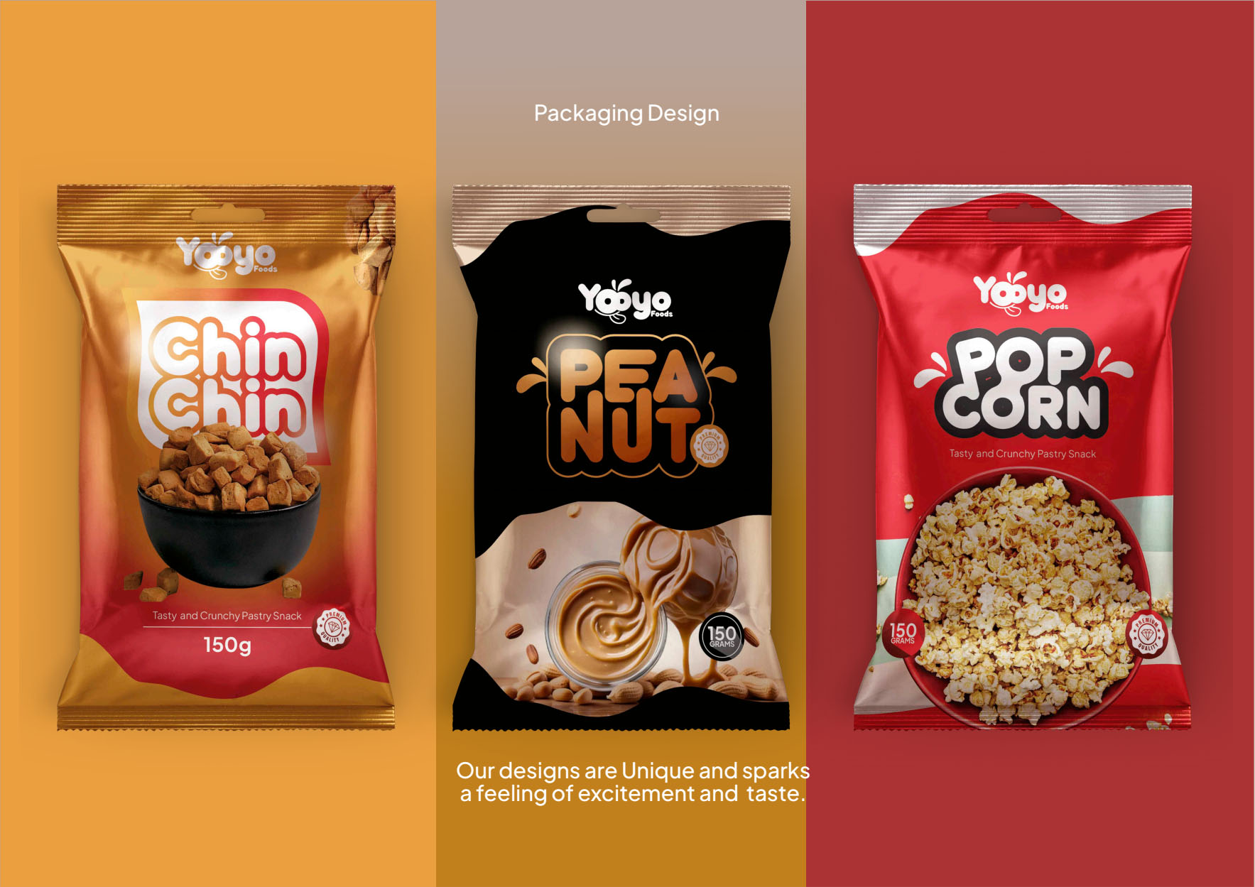
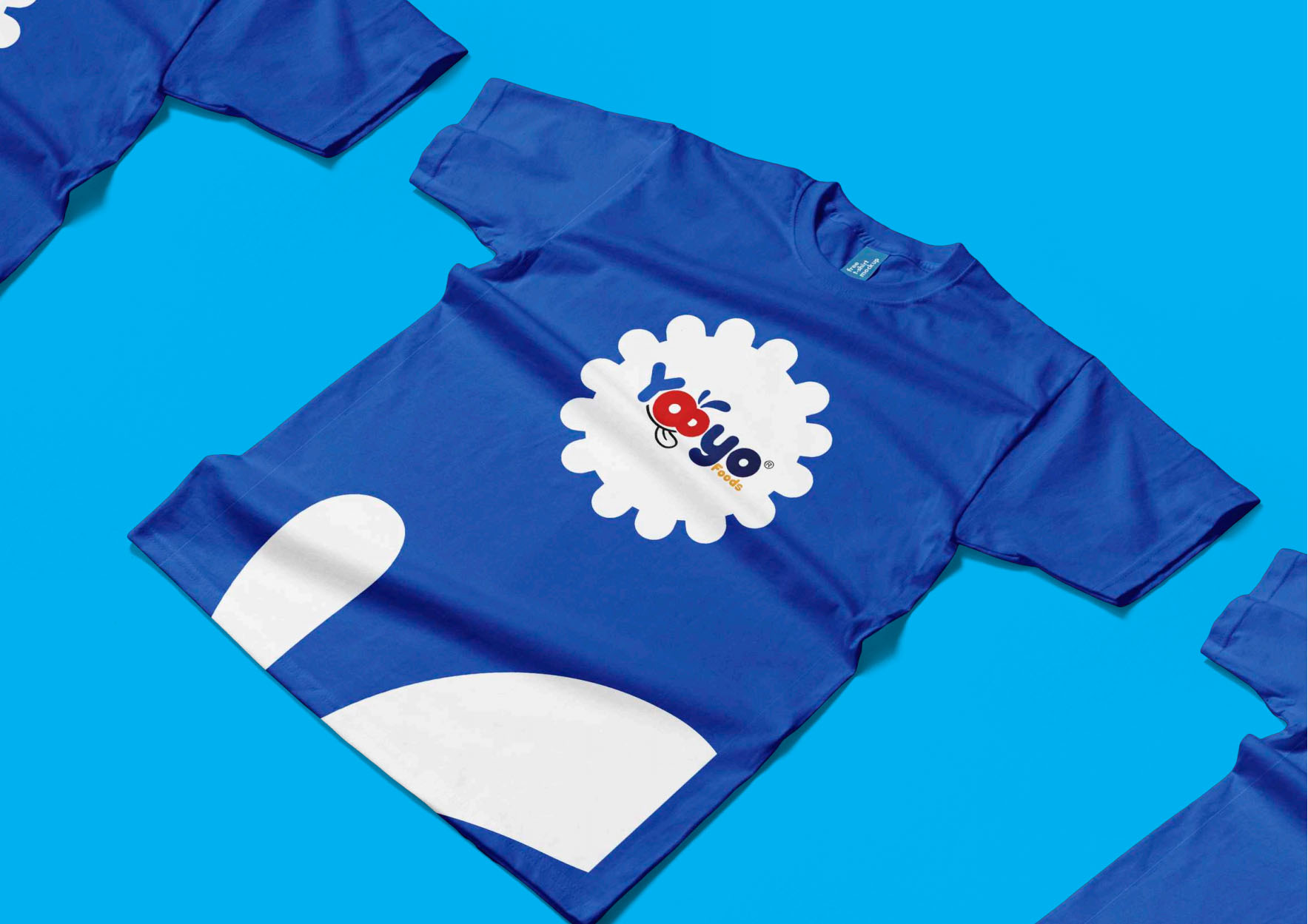
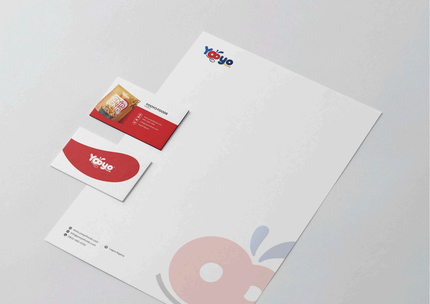
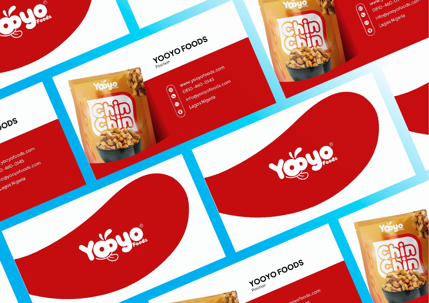
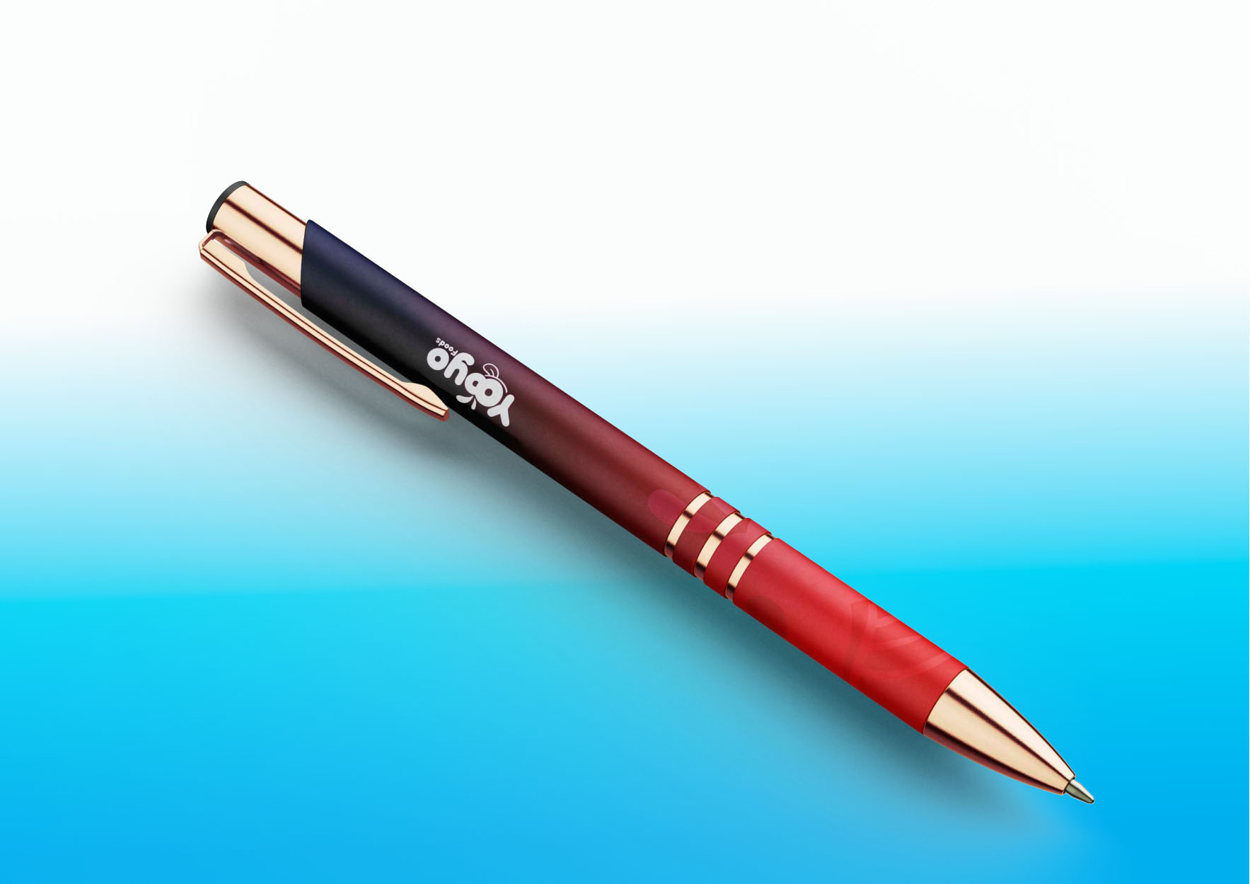
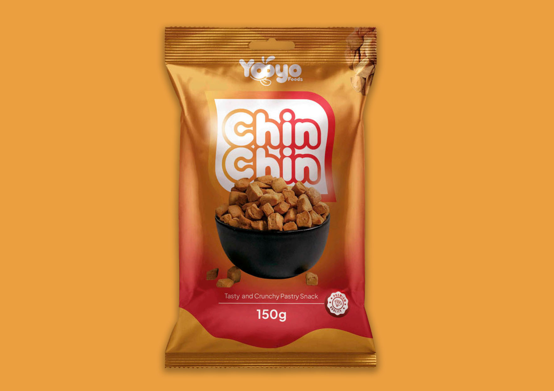
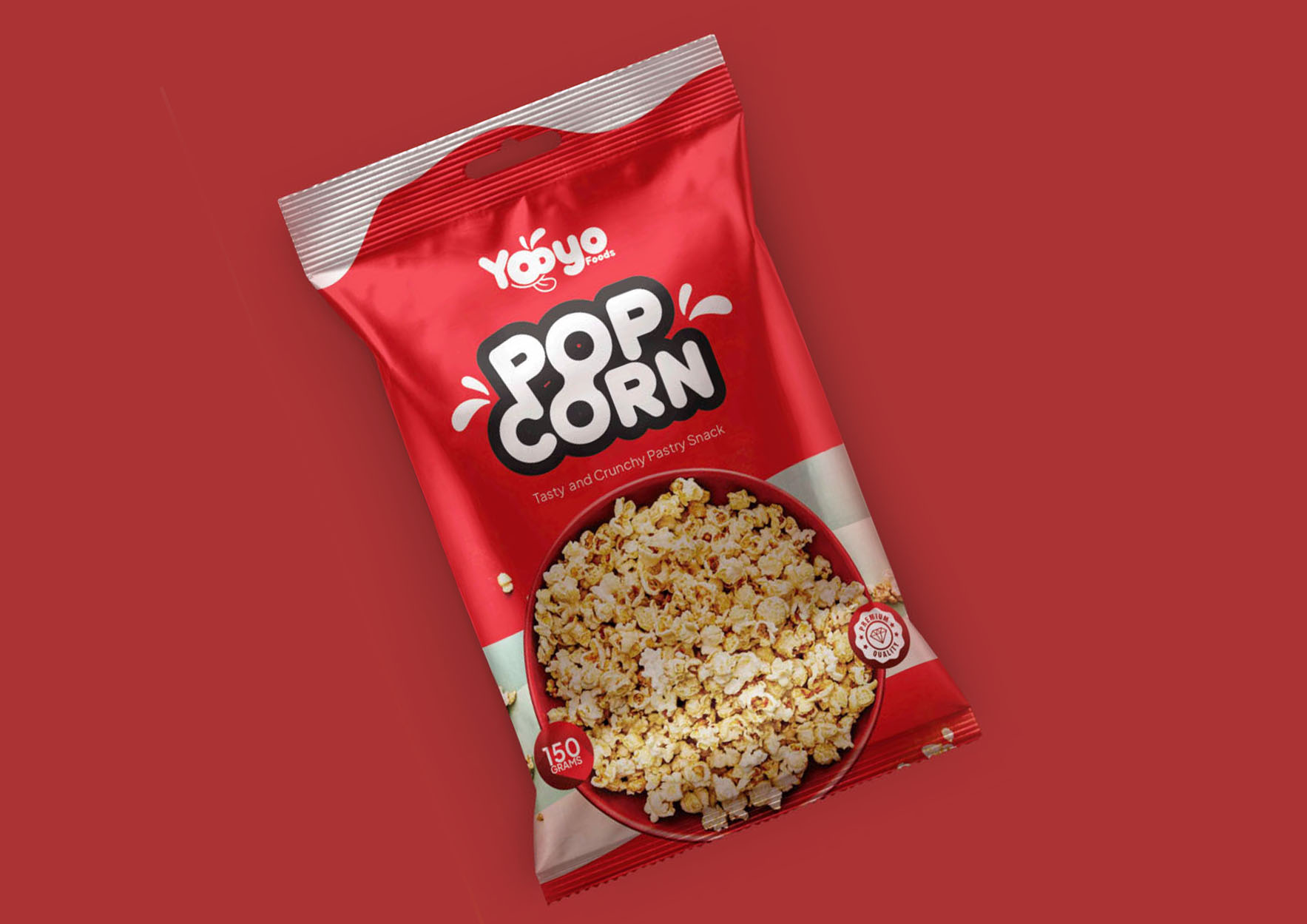
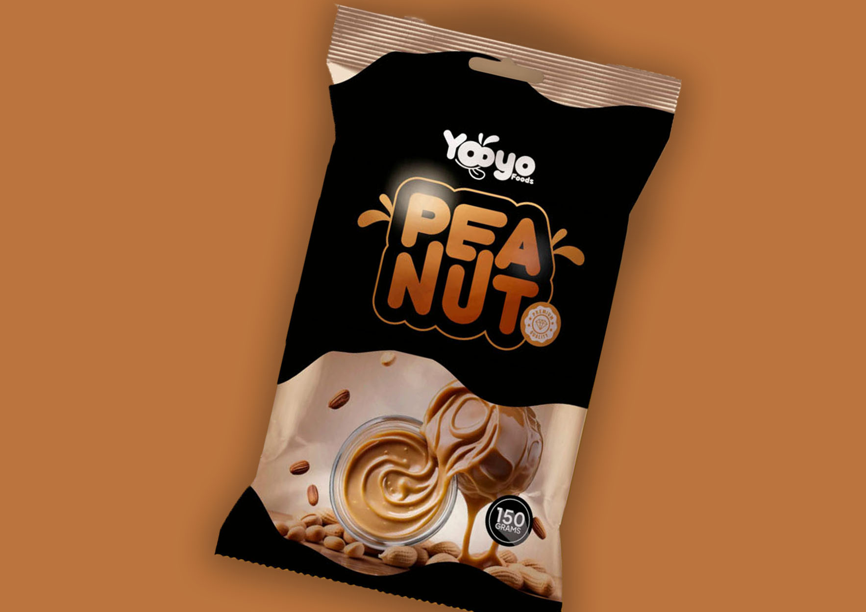
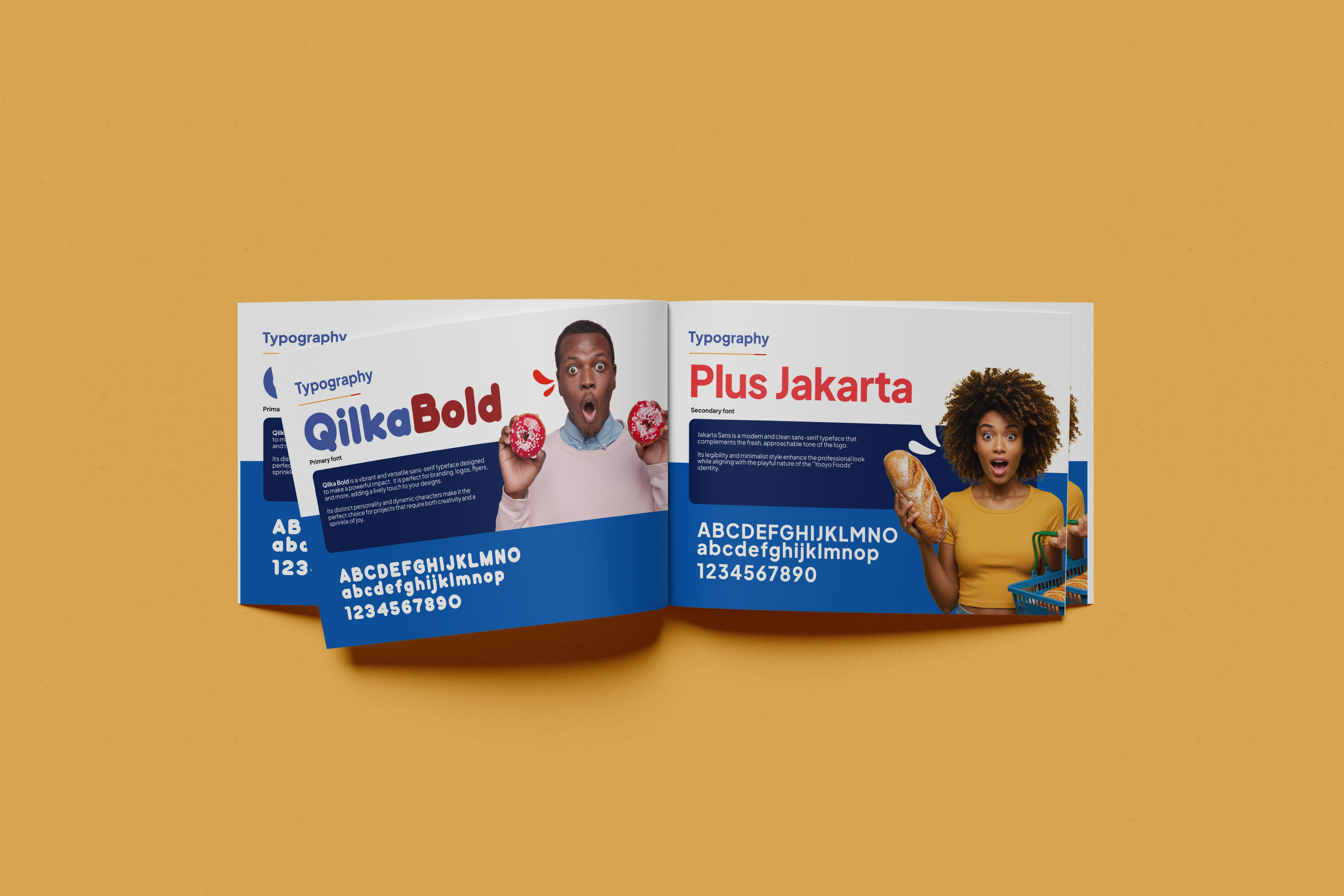
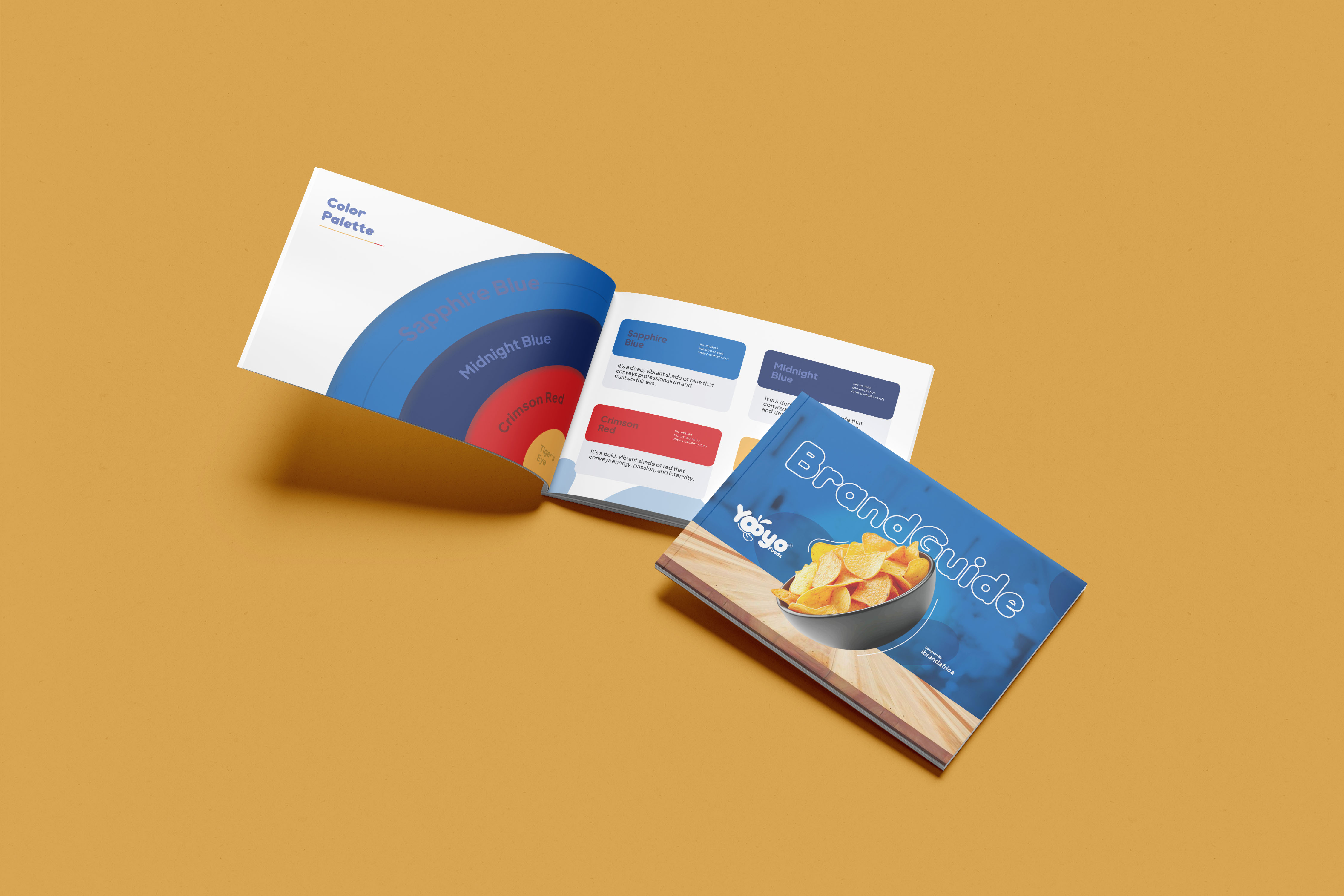
Here, we bring the logo to life by showcasing how it works with real-world items. We apply unique mockups to portray different scenarios where the logo is in action.
App Design
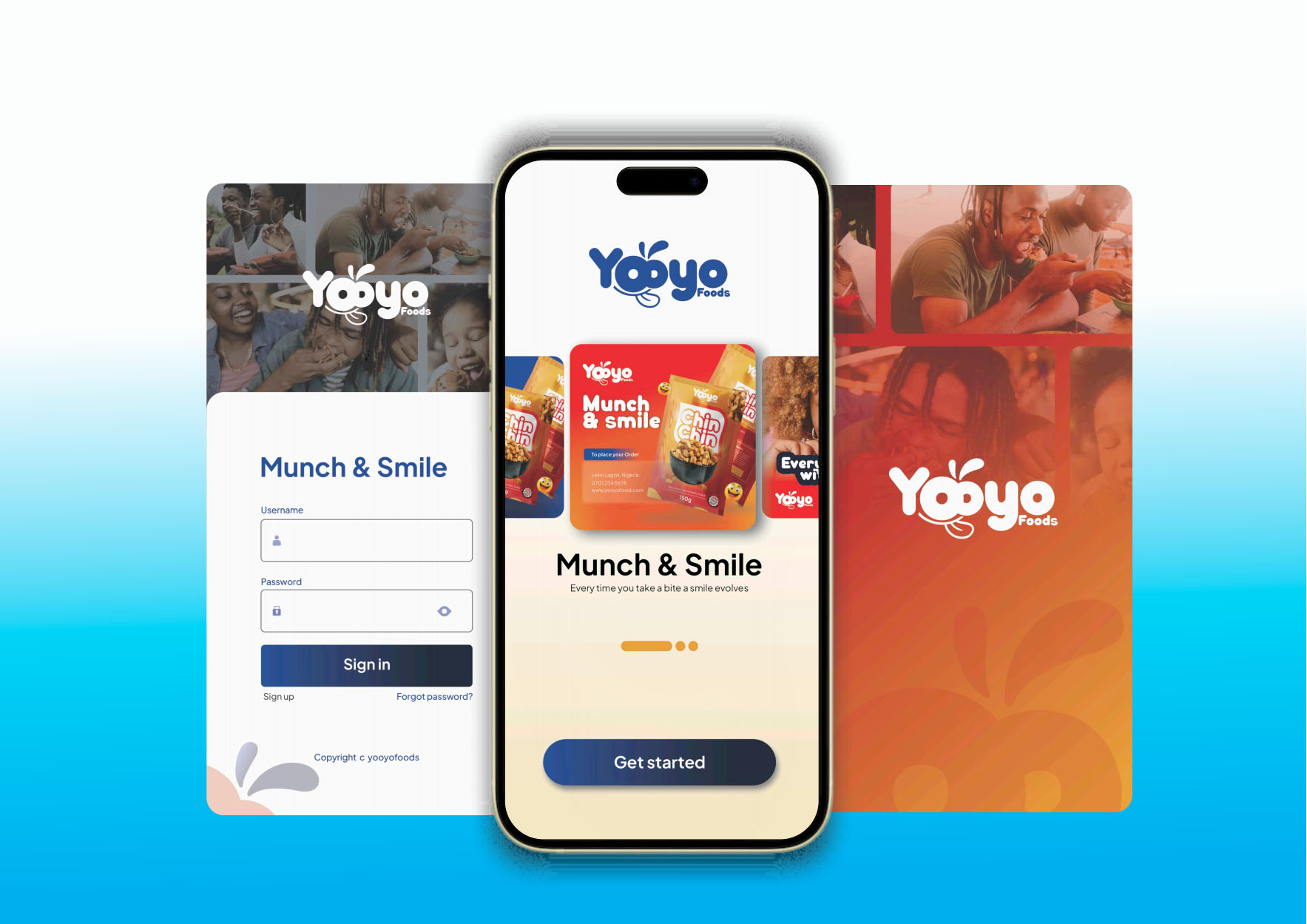
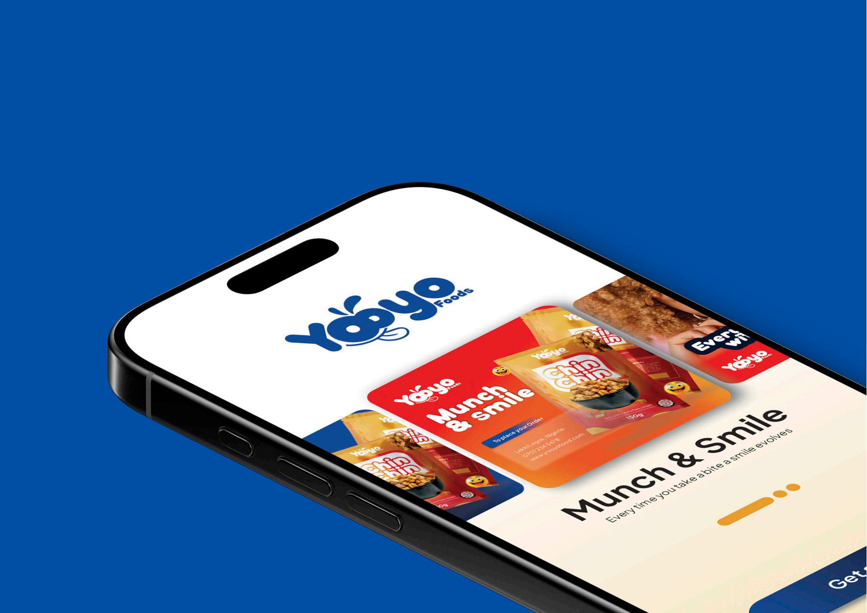
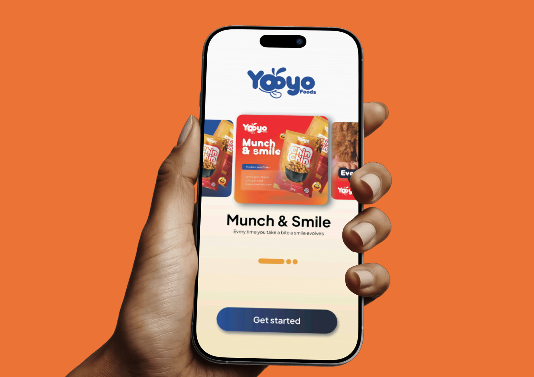
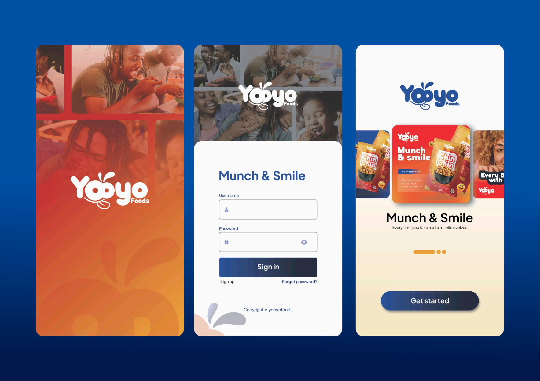
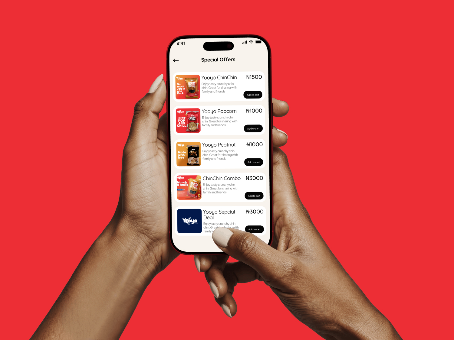
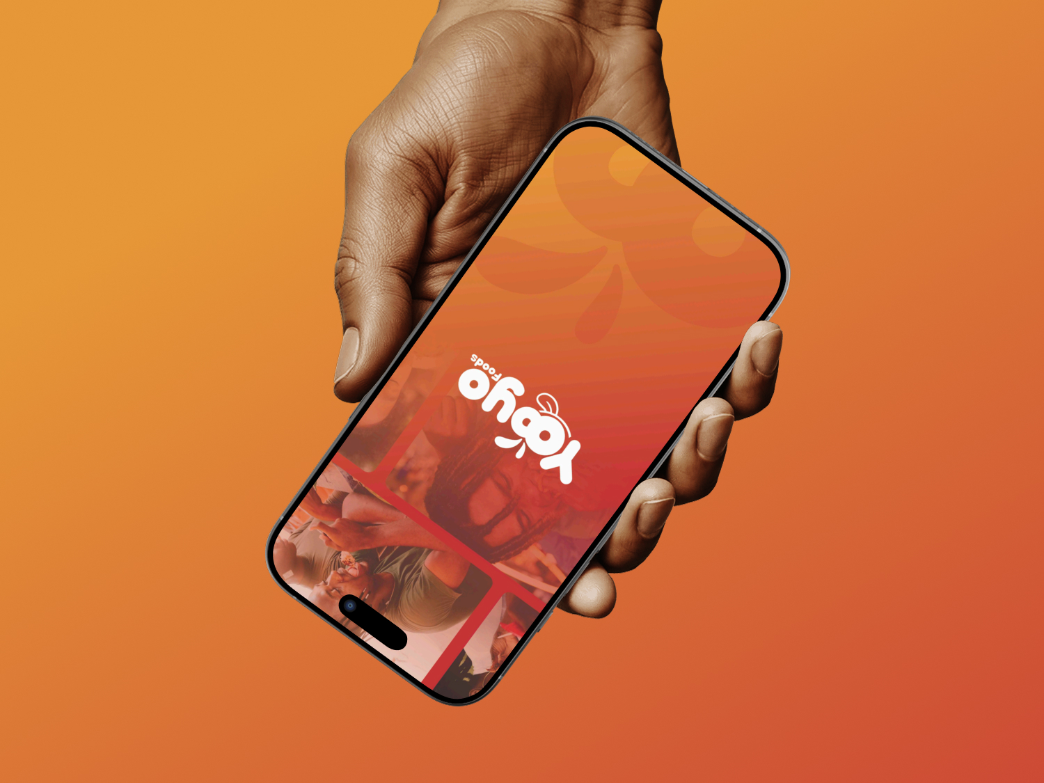
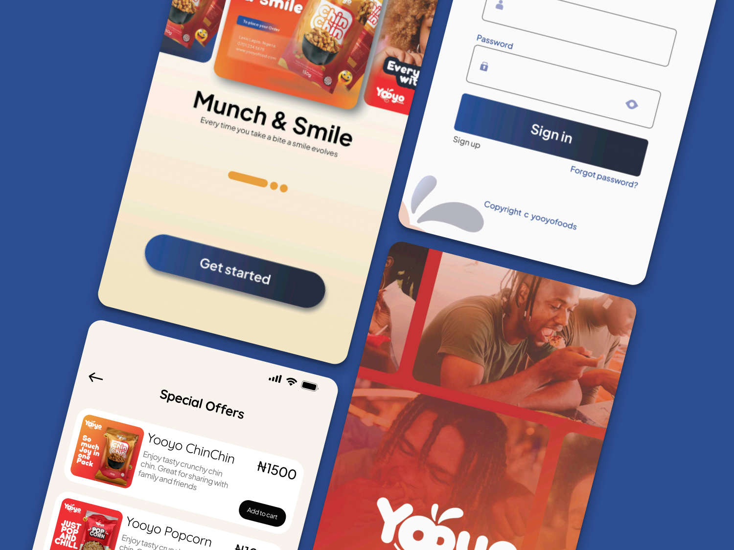
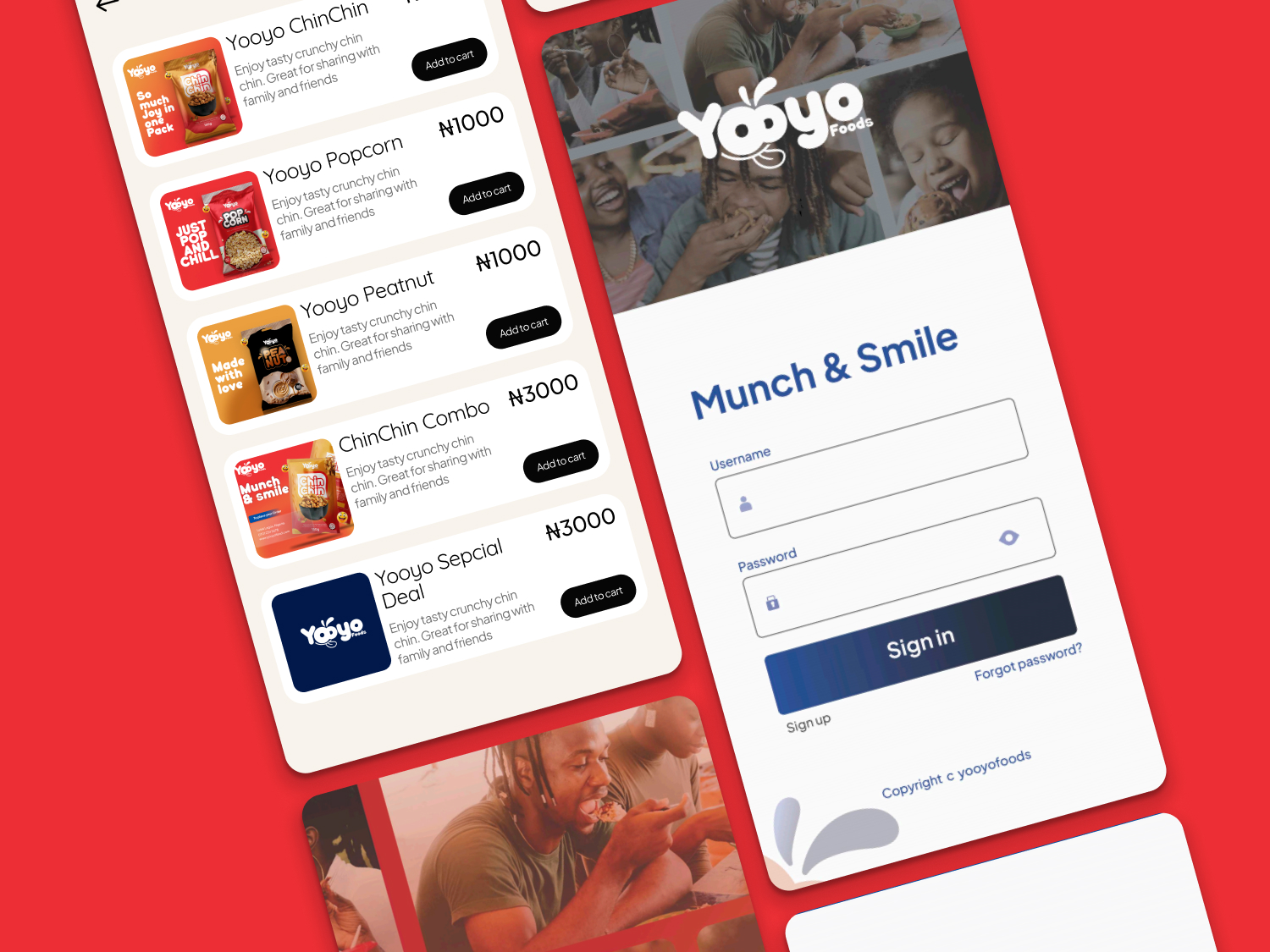
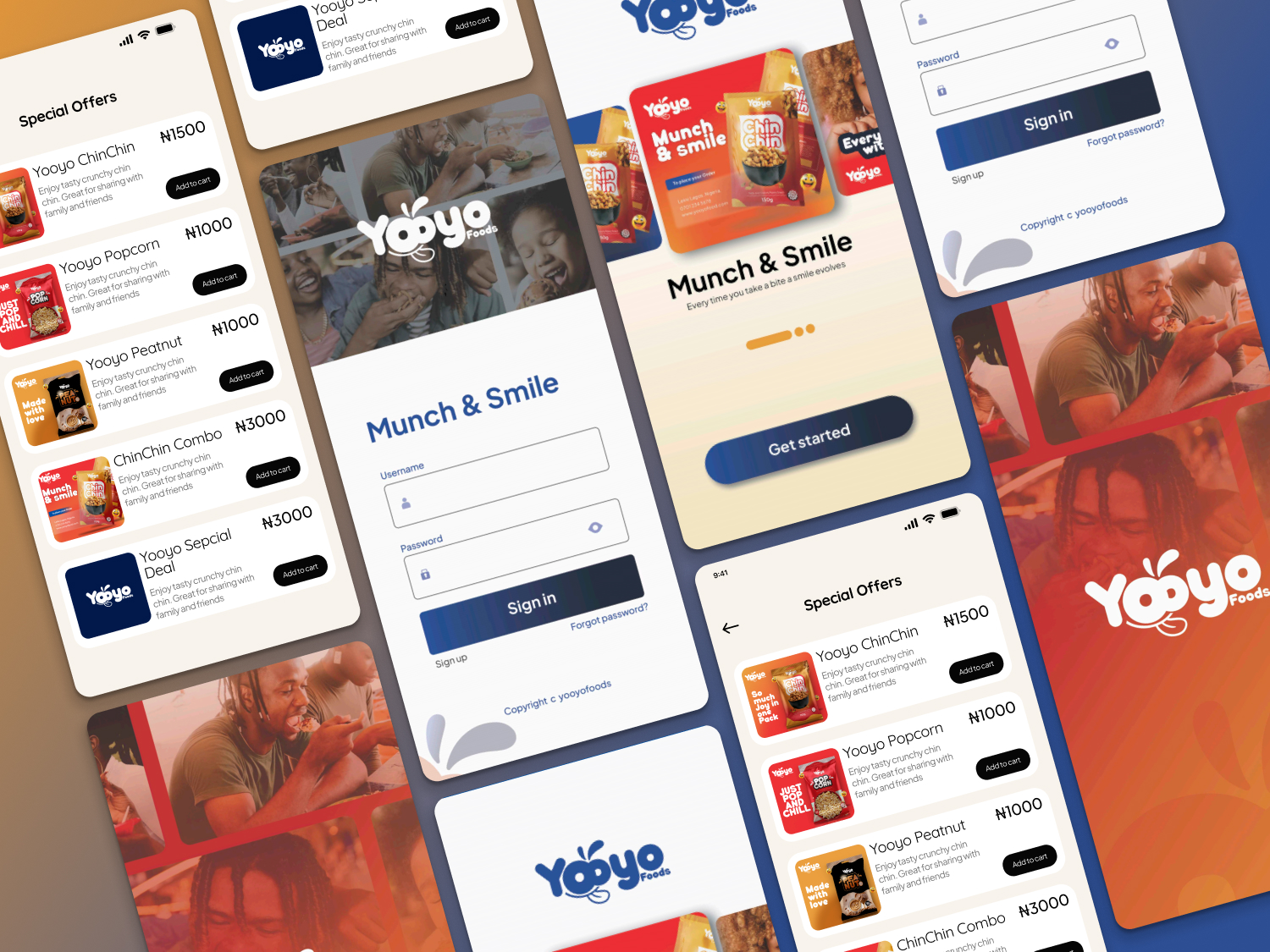
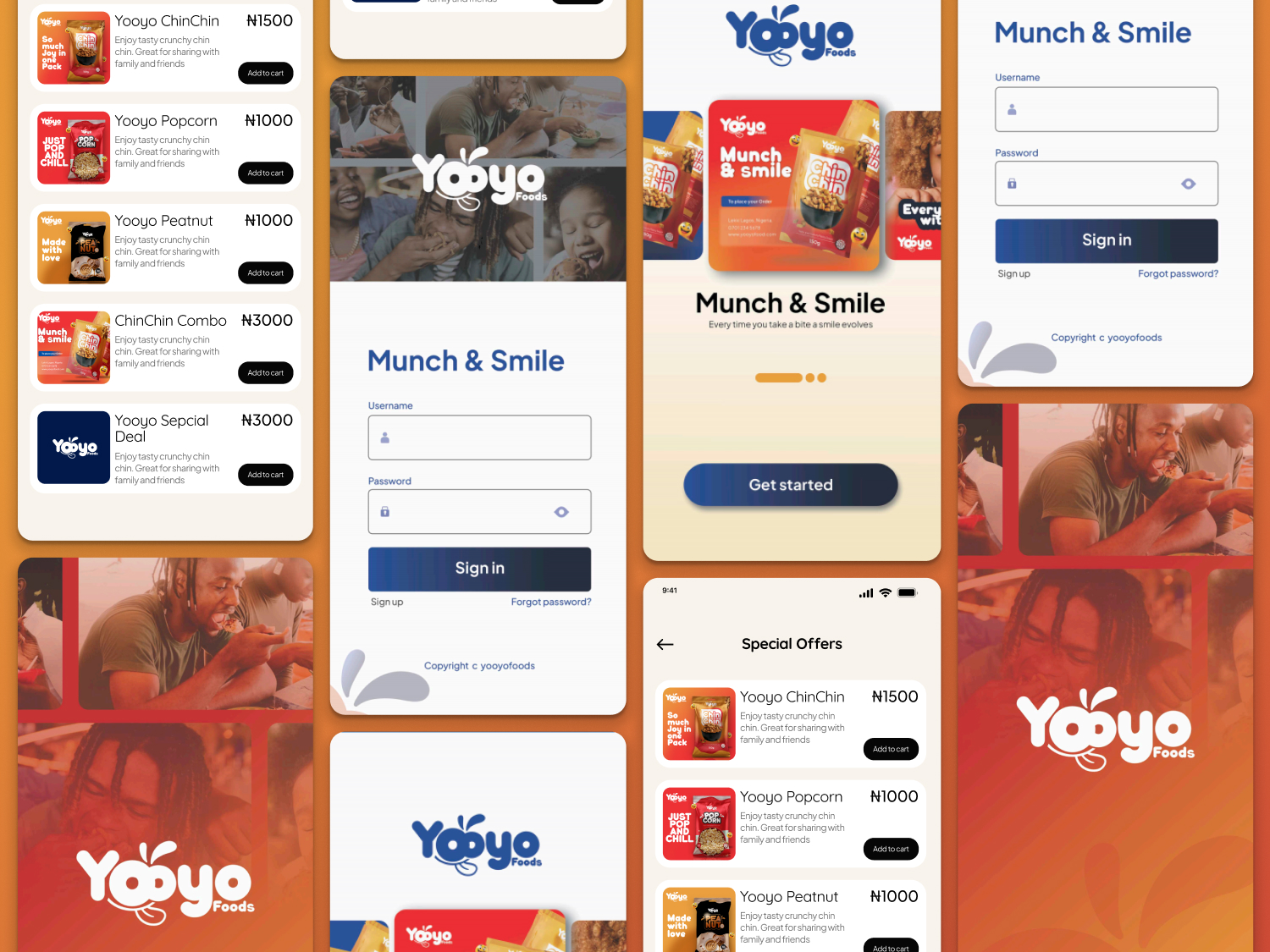
Using the best UI/UX standards and practices, we design an intuitive and user-friendly mobile to drive Yoyo Food's business needs.
Project Outcome
The Yooyo Foods brand design project resulted in a vibrant and memorable identity that effectively communicates freshness, health, and quality. The final design strengthened the brand’s emotional connection with its audience, enhancing recognition and trust across digital and physical platforms.