- Client
- Kinga Ltd
- Industry
- Fintech
- Year
- 2023
Do you find that paying for things is sometimes too slow, or complicated? That hassle of inputting long card numbers, dealing with high fees, or missing out on easy sales because of old technology is frustrating and cuts into your time and profit. Kinga solves all that. It's a super easy, QR code-based / NFC (Near Field Communication) payment system that lets you pay or get paid instantly with just a simple scan of your phone. Kinga is fast, secure, and works everywhere—breaking down borders to make buying and selling simple again.
Project Overview
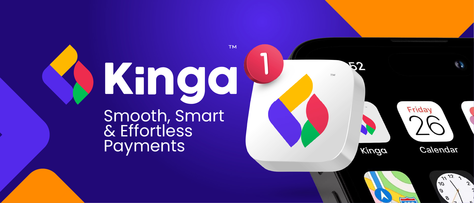
Before we started, Kinga needed to launch with an identity that could instantly compete and earn trust in the fast-paced, high-stakes world of financial technology. Without a strong, clear, and secure-looking brand, Kinga risked being overlooked or dismissed by both major businesses and everyday customers. We solved this by creating the Kinga brand. We delivered the simple yet dynamic logo and a clean, confident visual identity. This new branding immediately communicates trust, speed, and global reach. Kinga is now positioned as the smart, modern solution for payments, making it easy for customers to scan and for businesses to grow internationally from day one.
Logo Concept
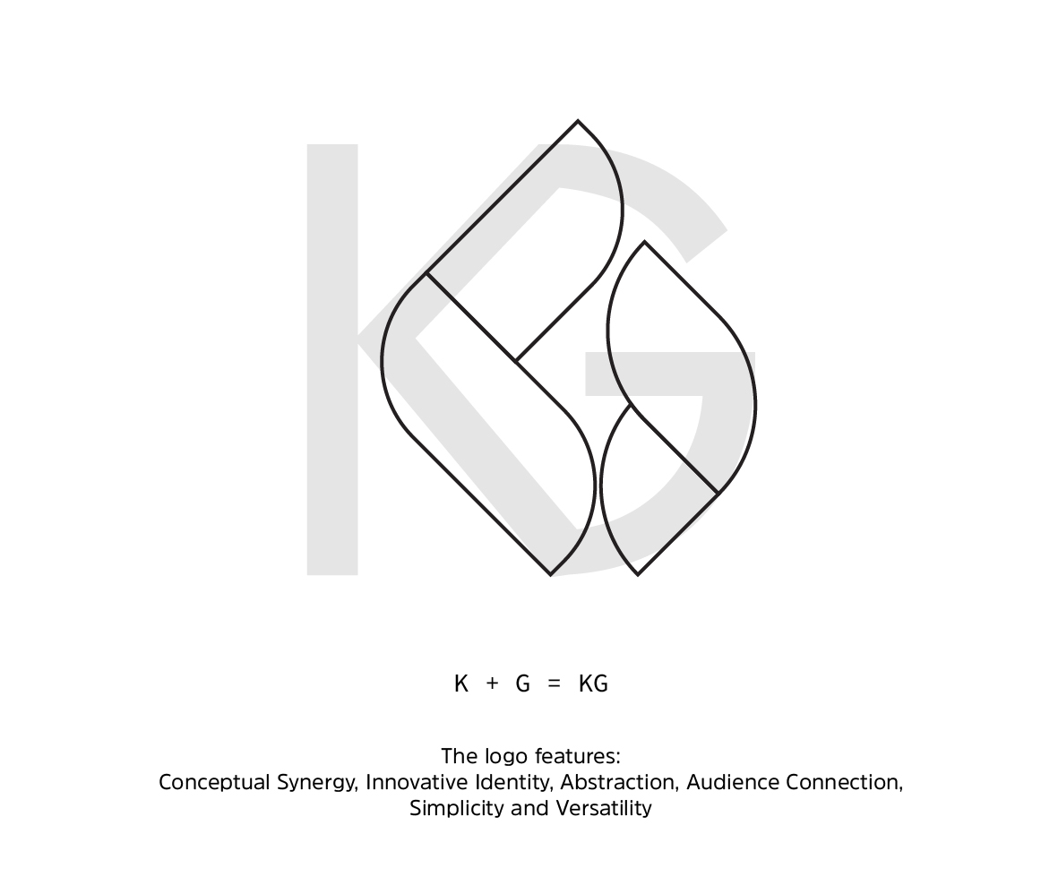
The Kinga Logo design is based on the 'K' and 'G' letters of the name, which interlock perfectly to create a single, forward-moving symbol. This abstract shape looks like a colorful flame or a forward moving arrow, which signals speed and progress. The logo is simple and clear so it can be seen anywhere, helping people quickly understand that Kinga is a modern, trustworthy, and fast way to pay.
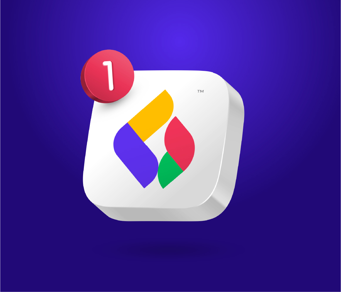
Logo Application
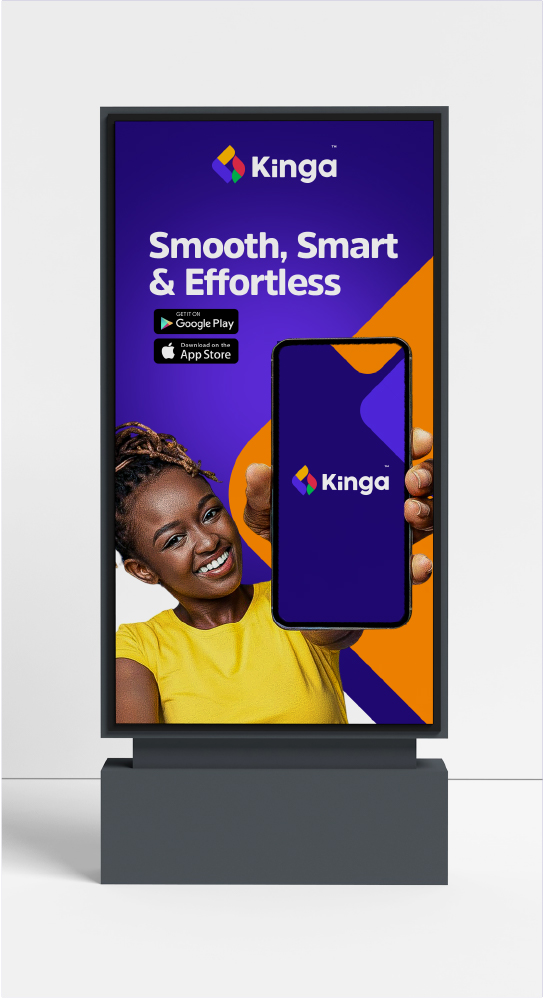
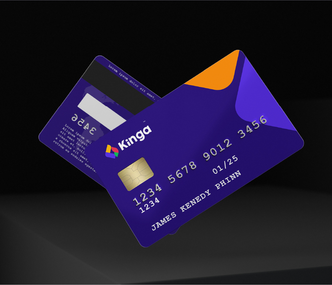
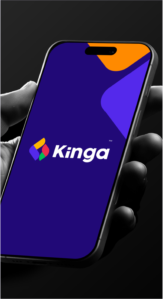
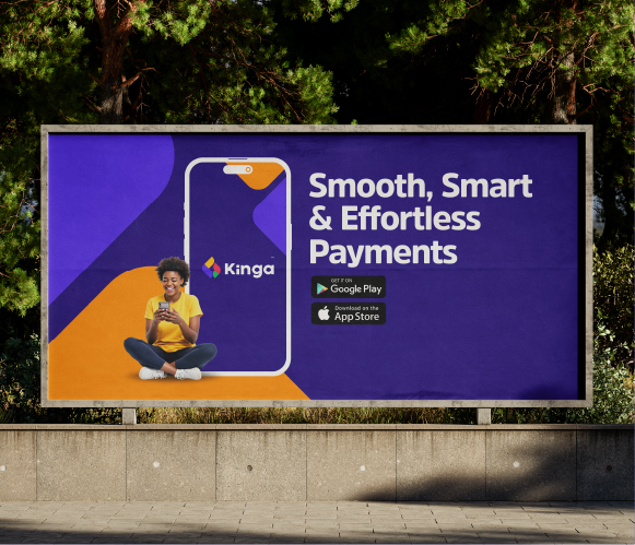
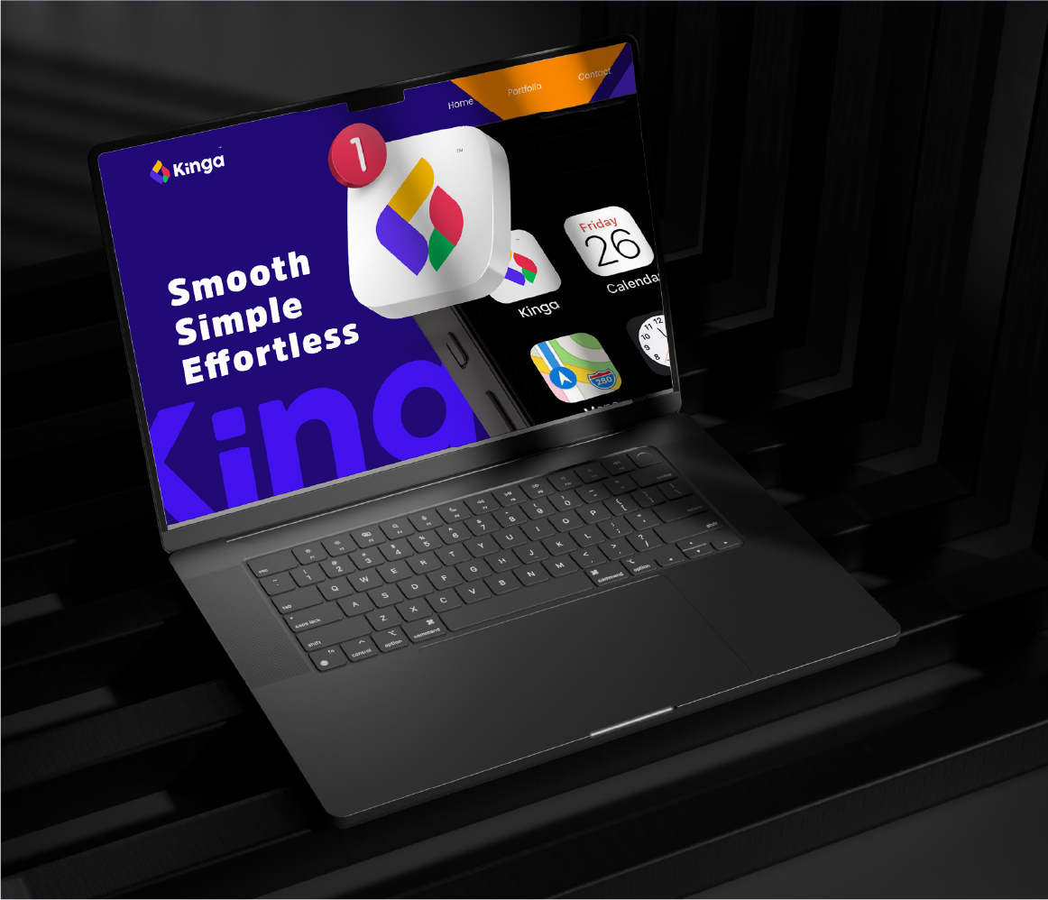
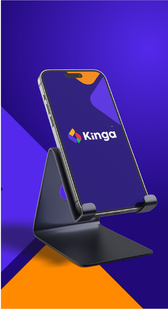
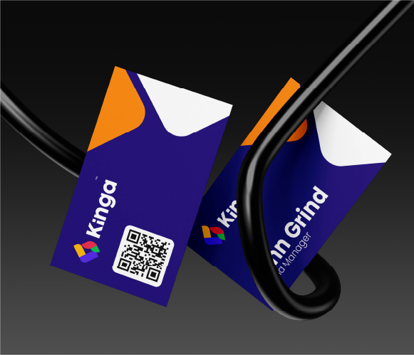
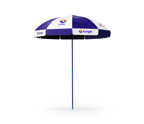
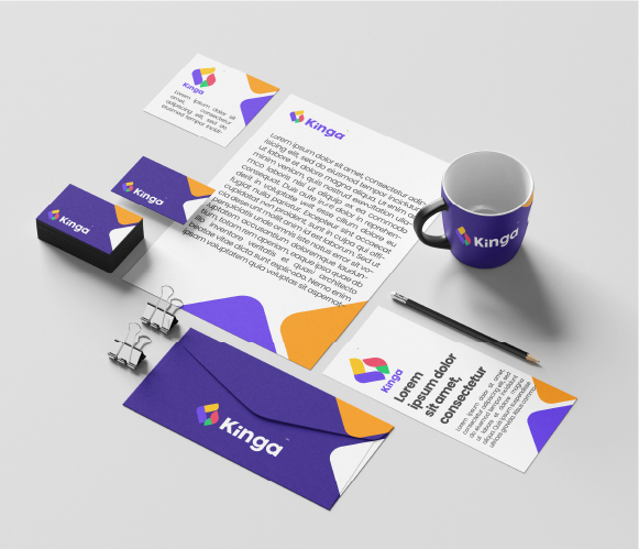
Logo On Stationery