- Client
- Bilicious Ltd
- Industry
- Confectionery
- Year
- 2025
Bilicious Ltd is a confectionery brand (a sweet food company) that makes and sells delicious treats. Their brand is built to be fun, fresh, and friendly. Everything they do—from the packaging of their treats to the shirts their staff wear—is designed to make customers feel happy and excited about their treats. They aim to make every sweet moment feel complete and enjoyable!
Overview
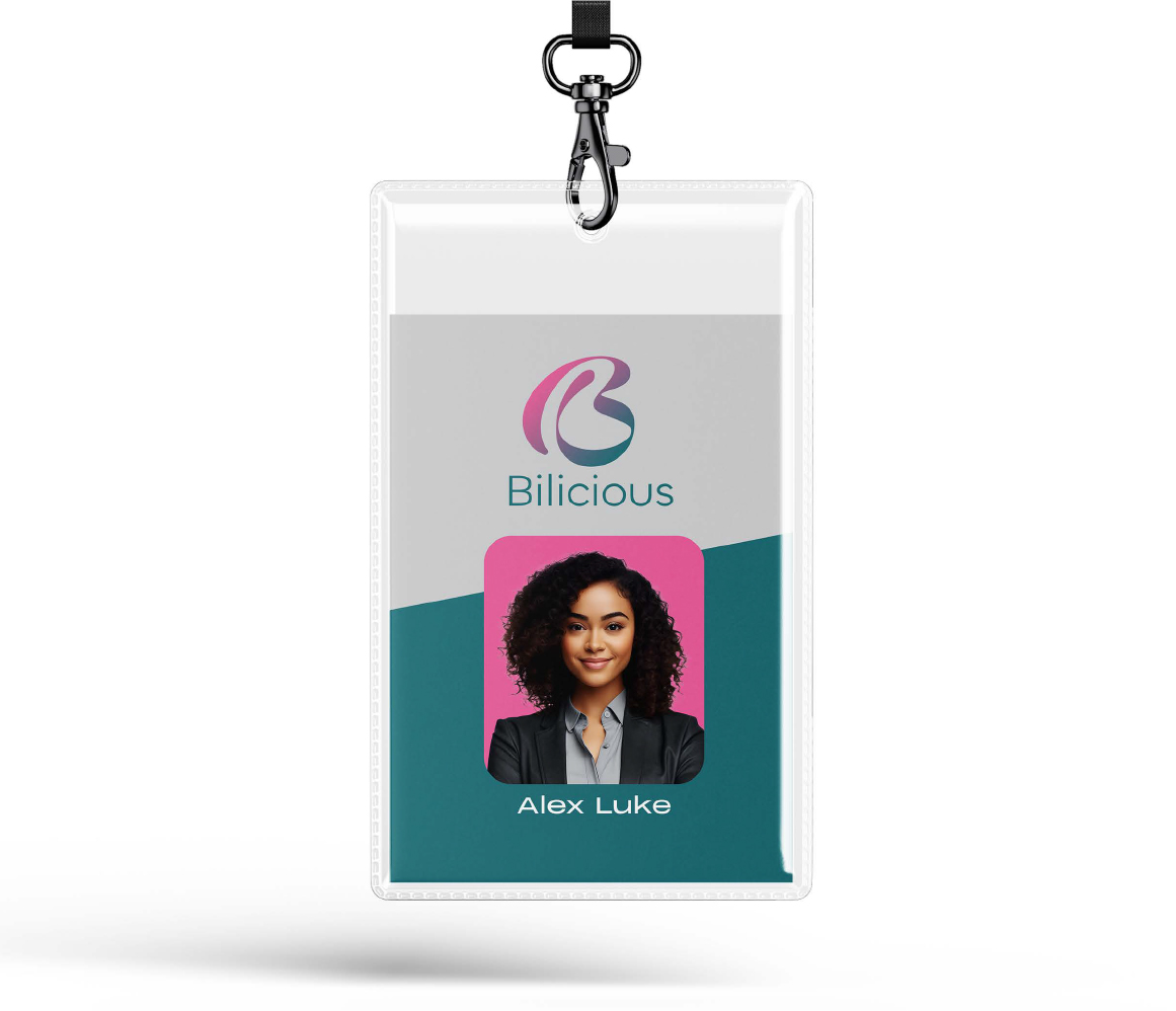
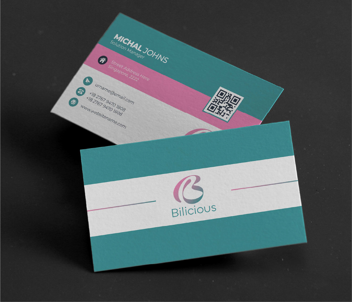
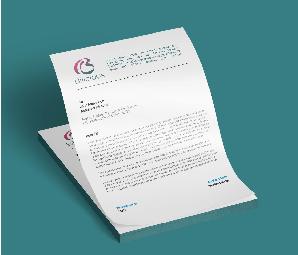
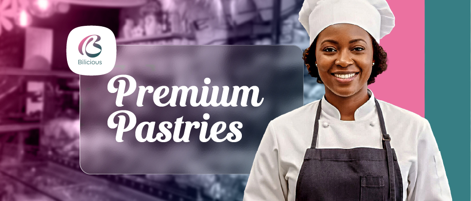
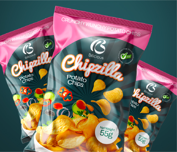
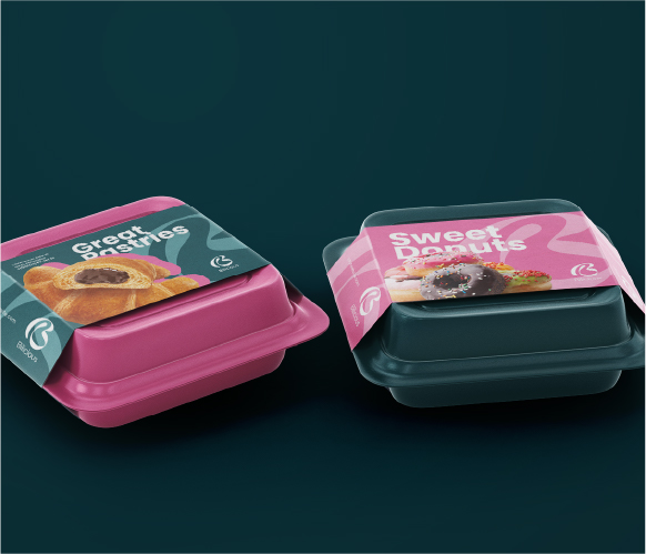
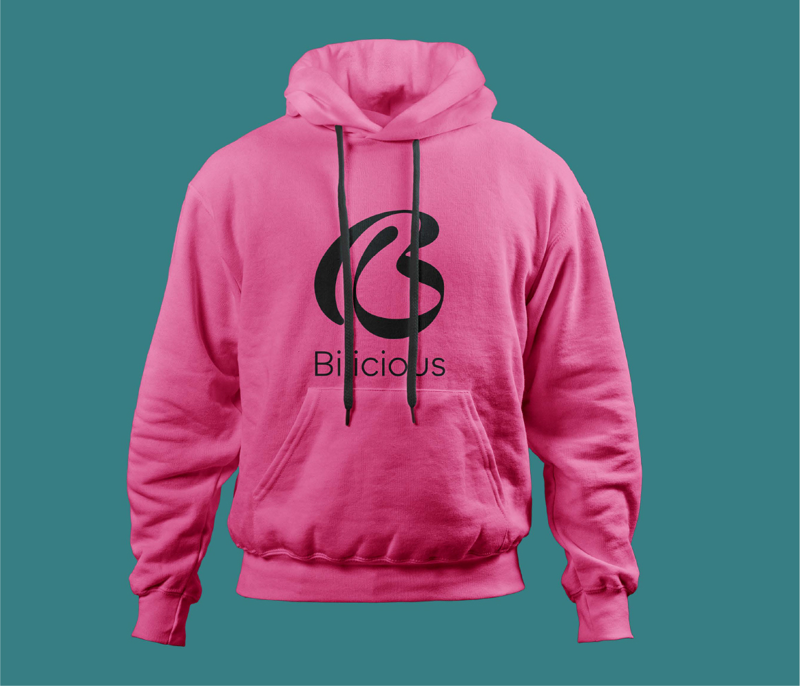
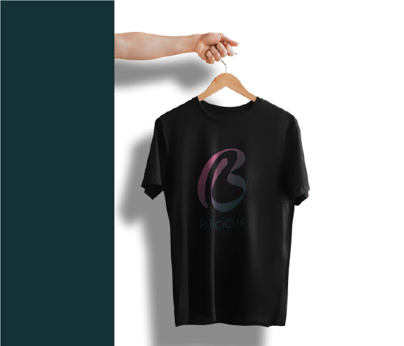
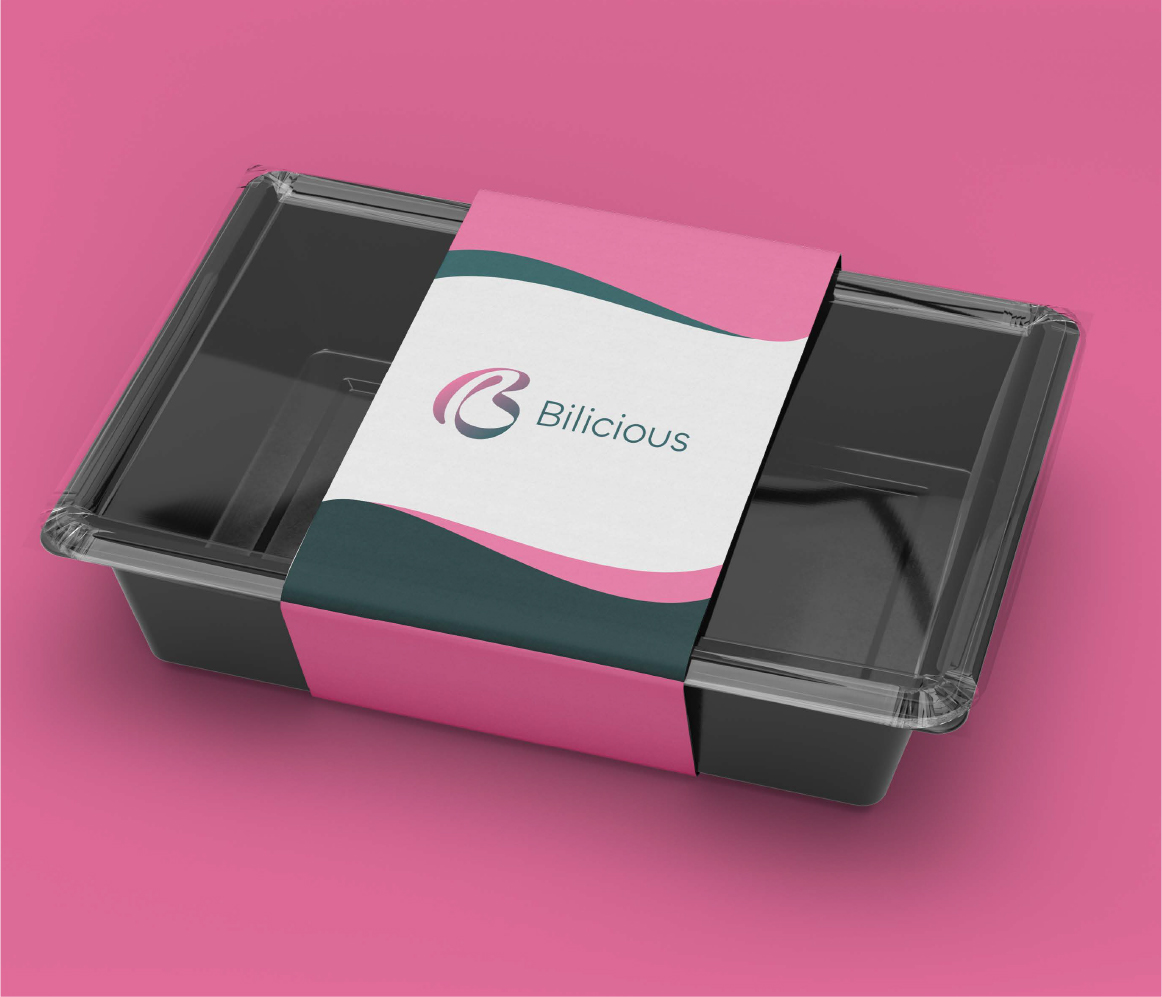
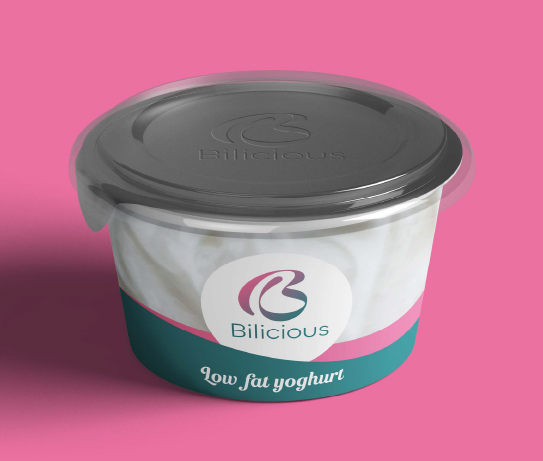
The goal was to create a strong, sweet, and memorable look for this confectionery company. We designed everything, from the logo, the packaging, and even the staff uniforms. We made sure the brand colors and the overall style gave a clear feeling of fun and quality. Bilicious now has a complete, professional identity that is ready to grab the attention of customers and grow their business.
Logo Ideation
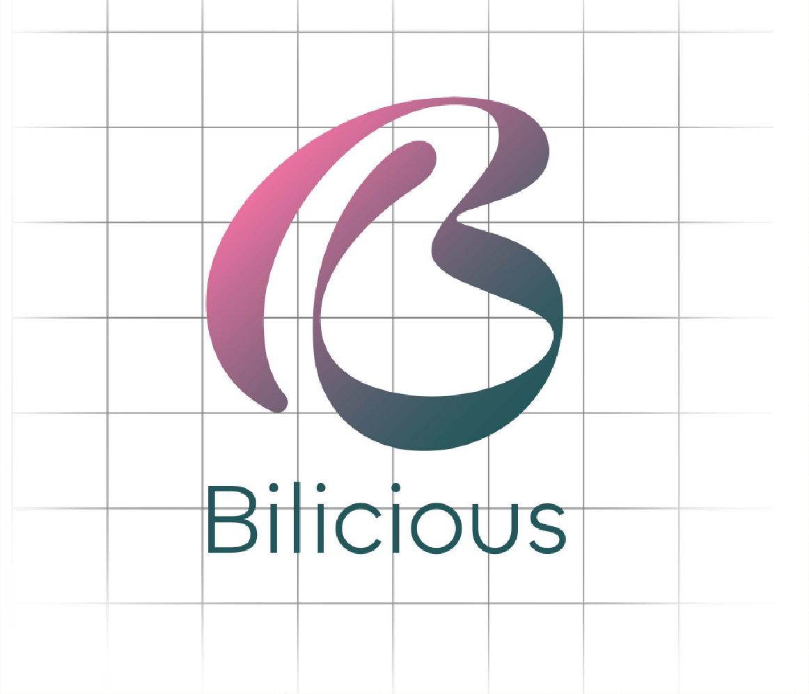
The Bilicious logo is a stylish, flowing letter "B." We designed the letter to look beautiful and soft, almost like icing or a swirl of liquid chocolate. The way the lines of the "B" connect with smooth curves is meant to show unity and a sense of completeness. The gentle color shift from pink to teal makes the logo modern and vibrant, catching your eye and leaving a positive, sweet impression.
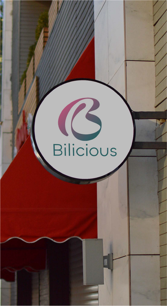
Logo Application
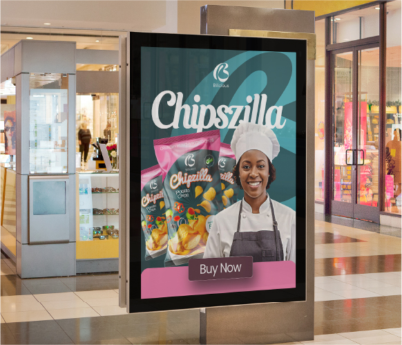
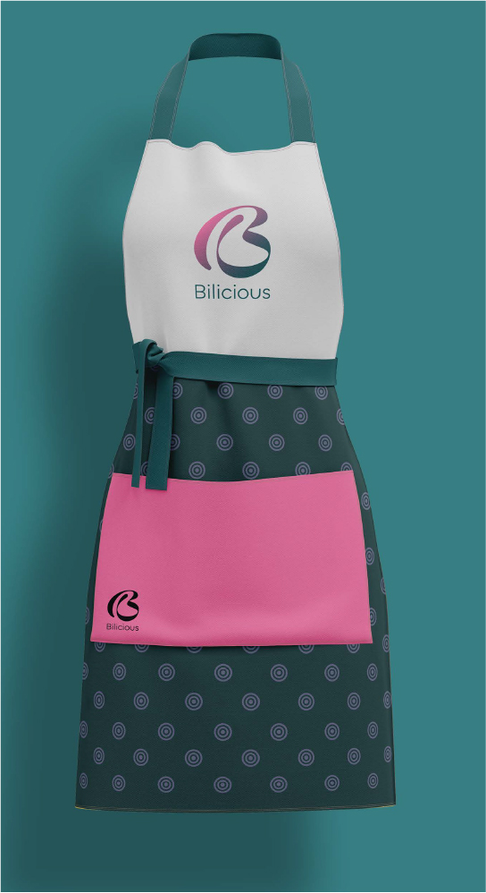
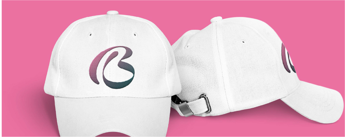
Stationery